TJ Maxx
- Custom Typeface
- Direction by Matt Van Leeuwen and Sonsoles Otero, McCann
- Images courtesy of McCann
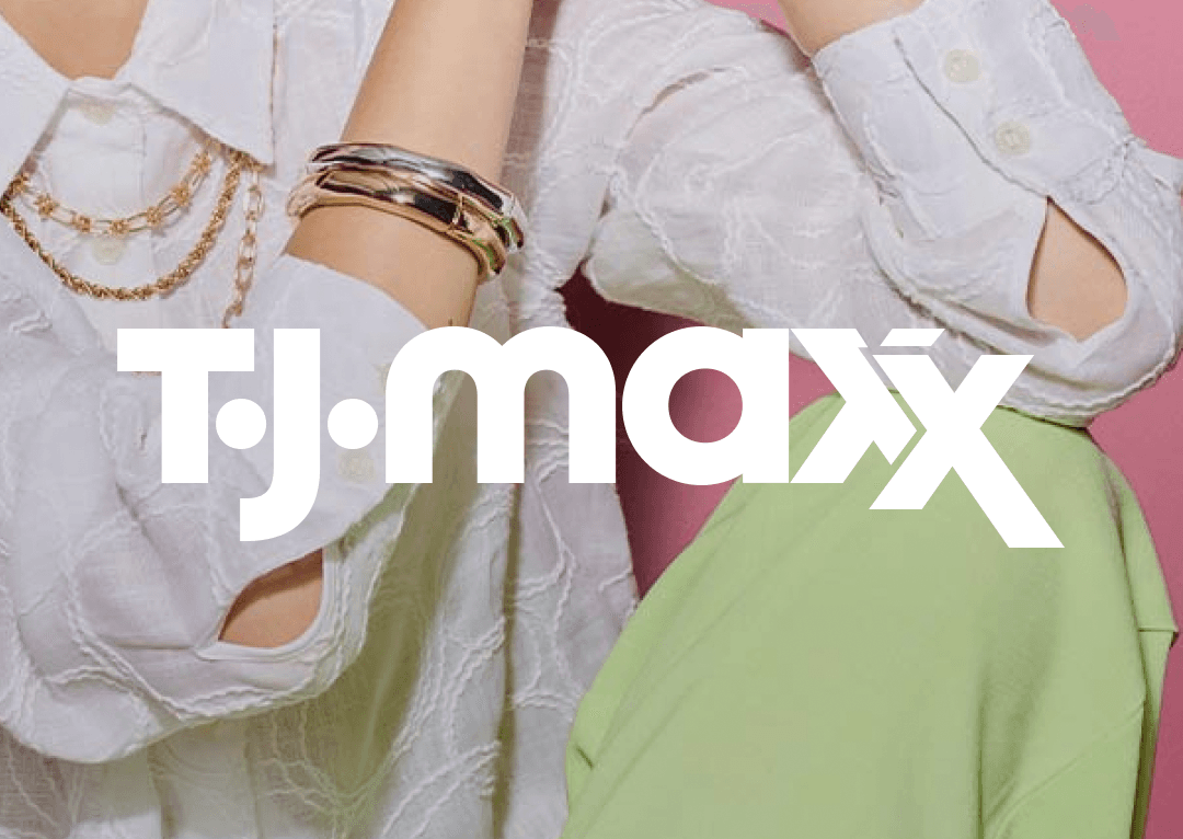
TJ Maxx is a major American department store chain, known for offering brand-name goods at lower prices than other retailers. As part of a rebrand led by McCann, we created an expressive custom typeface family that captures the brand’s unique visual character.
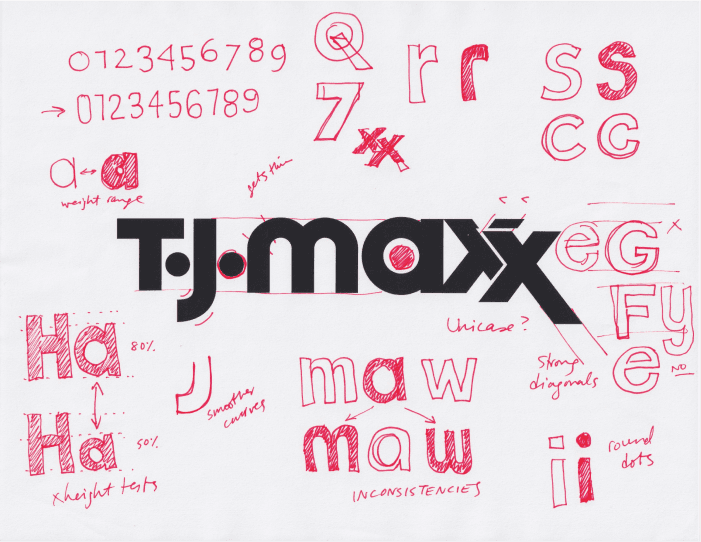
The fonts draw inspiration directly from the iconic TJMaxx logo, embracing its unconventional details, like the contrasting construction of the “a” and “m,” and the distinctive “xx” ligature. These quirks became the foundation for a type system that feels both bold and unmistakably TJ Maxx.