Bon Appétit
- Logo and Custom Typeface
- Direction by Arsh Raziuddin and Caroline Newton
- Images courtesy of Condé Nast
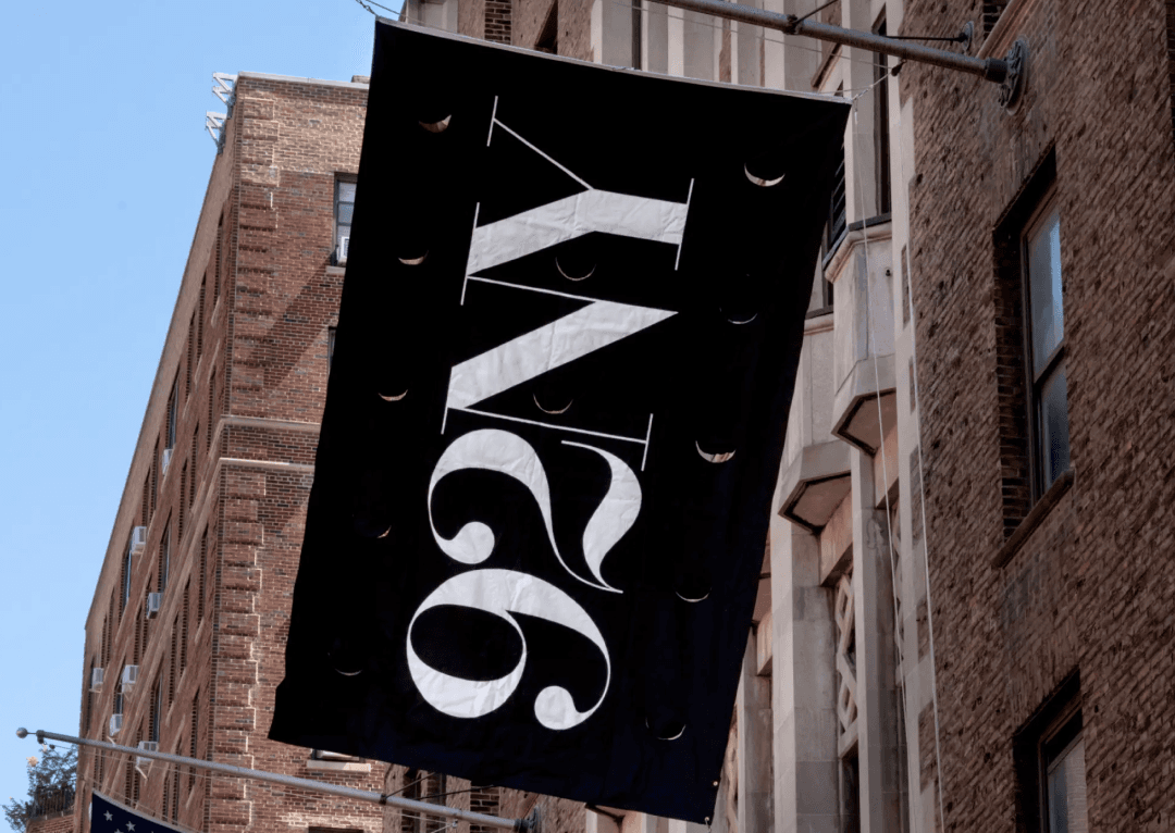
We collaborated with Bon Appétit to create a new logo and custom typeface that evoke the nostalgic charm of 60s and 70s cookbooks. Drawing inspiration from this golden era of culinary visual culture, we designed Aperitif, a custom typeface that celebrates the best of serifs from the phototype era, including influences from the iconic ITC Garamond.
The new logo features subtly rounded letterforms, giving the wordmark a warmer, more organic quality that resonates with the magazine's sophisticated yet approachable readership. High-contrast strokes and refined details, such as ball terminals and a flourish on the gently curved acute accent of the letter é, add a touch of elegance and grace to the design.
This fusion of vintage inspiration with modern sensibilities resulted in a logo and typeface system that feels both timeless and contemporary, capturing Bon Appétit's unique balance of tradition and innovation.


