American Express
- Logo
- Direction by Abbott Miller and Kim Walker, Pentagram
- Images courtesy of Pentagram
MCKL collaborated with Pentagram to modernize the iconic American Express brand wordmarks, refining and unifying the company’s visual identity. The previous branding featured inconsistent lettering styles, presenting an opportunity to create a more standardized and cohesive typographic system.
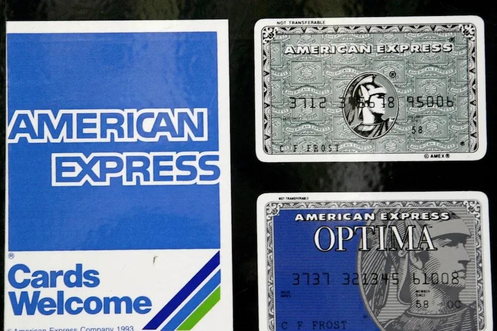
To address this, MCKL developed a refined version of the full “out of the blue box” wordmark, ensuring consistency with the lettering inside the iconic Blue Box logo while maintaining the brand’s heritage. This update provided a more unified and flexible typographic foundation.
For small-scale applications, MCKL also designed a shorthand “AmEx” version, distilling the brand’s identity into a compact yet instantly recognizable form. These refinements ensure that American Express maintains a strong and consistent presence across all touchpoints, from digital platforms to physical signage.