Fisher Price
- Logo and Custom Typeface
- Direction by Emily Oberman, Tim Cohan, Laura Berglund, and Mira Khandpur, Pentagram
- Images courtesy of Fisher Price and Pentagram
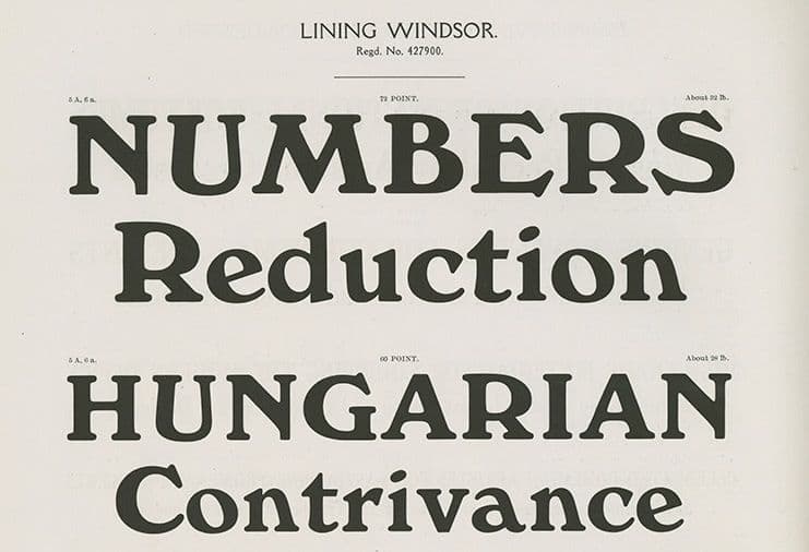
Fisher-Price is an iconic brand known for creating educational toys for infants, toddlers, and preschoolers. MCKL collaborated with Pentagram to modernize its classic wordmark, which shared qualities with the well-known Windsor typeface. We refined the lettering, setting the name in lowercase and introducing distinctive details, including an fi ligature and a custom hyphen, to enhance its character.
In addition to the wordmark, we designed a playful custom typeface, a sans-serif counterpart that complements the brand’s identity. This typeface comes in two versions: a standard style and a “bouncy” variation, which adds a sense of movement and fun, giving Fisher-Price a dynamic way to animate its brand voice.