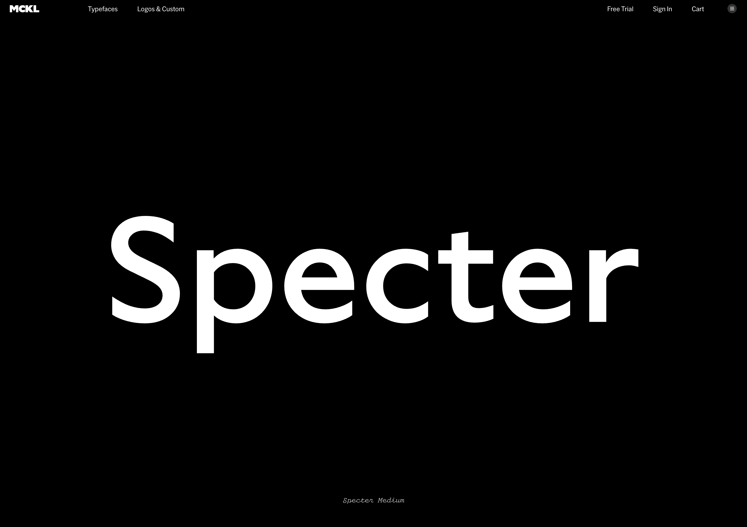
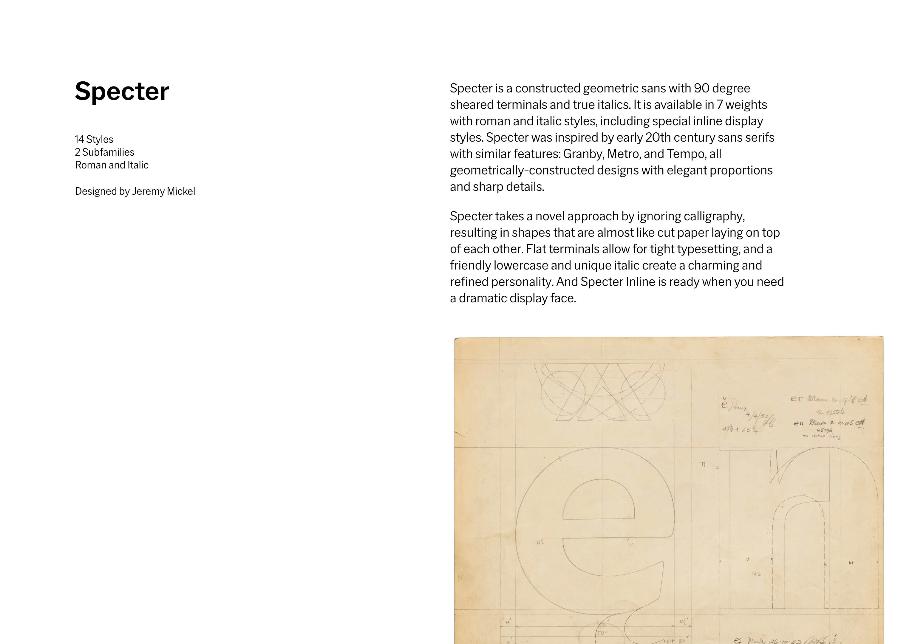

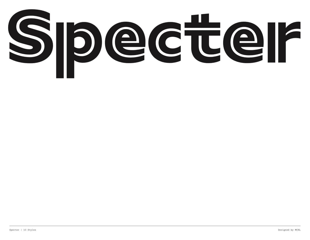
Specter
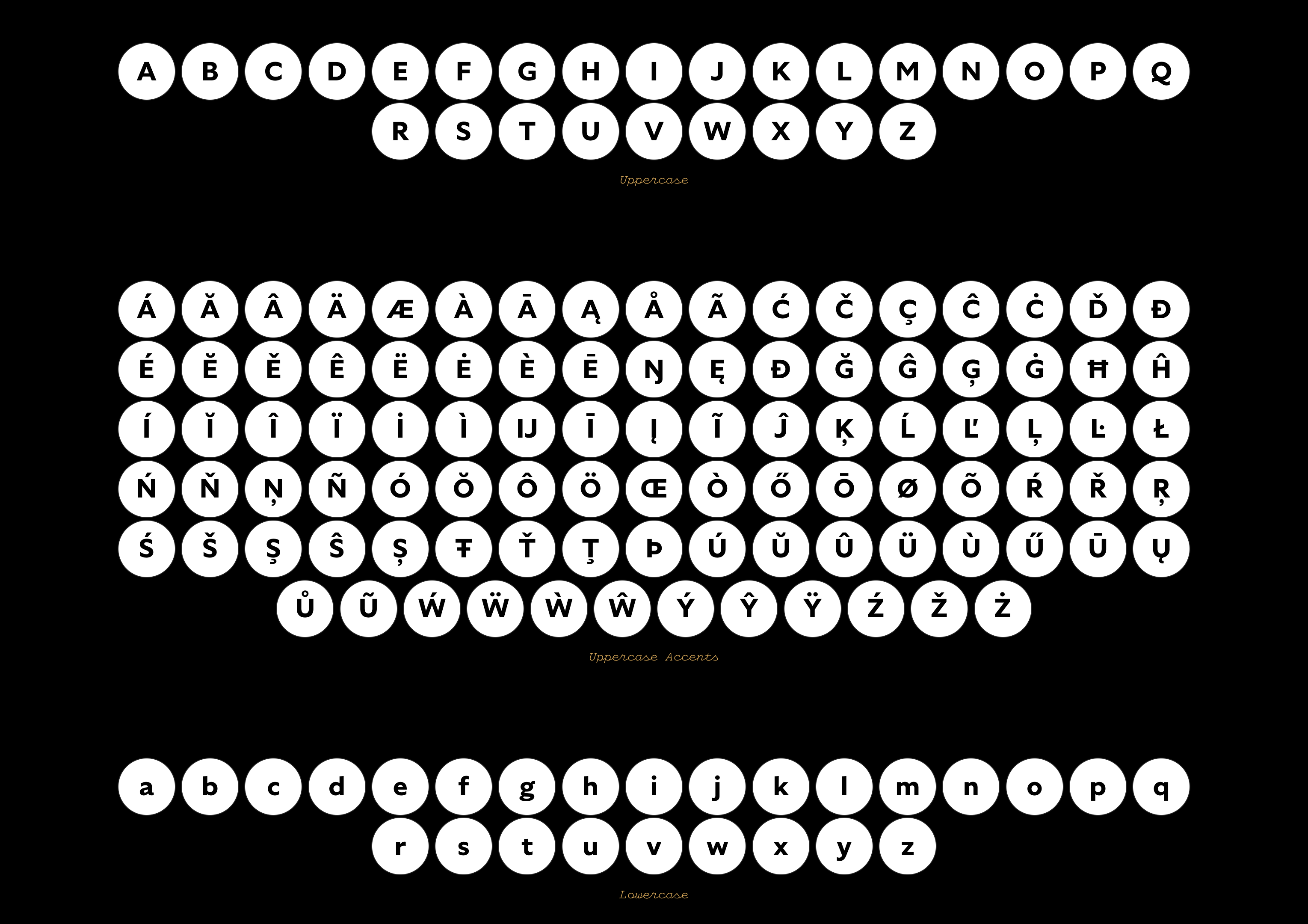
- 14 styles 7 weights Roman and Italic
- Designed by Jeremy Mickel
- With assistance by Douglas Hayes
- Published in 2017
Specter is a constructed geometric sans with 90 degree sheared terminals and true italics. It is available in 7 weights with roman and italic styles, including special inline display styles. Specter was inspired by early 20th century sans serifs with similar features: Granby, Metro, and Tempo, all geometrically-constructed designs with elegant proportions and sharp details.

Specter takes a novel approach by ignoring calligraphy, resulting in shapes that are almost like cut paper laying on top of each other. Flat terminals allow for tight typesetting, and a friendly lowercase and unique italic create a charming and refined personality. And Specter Inline is ready when you need a dramatic display face.
Related
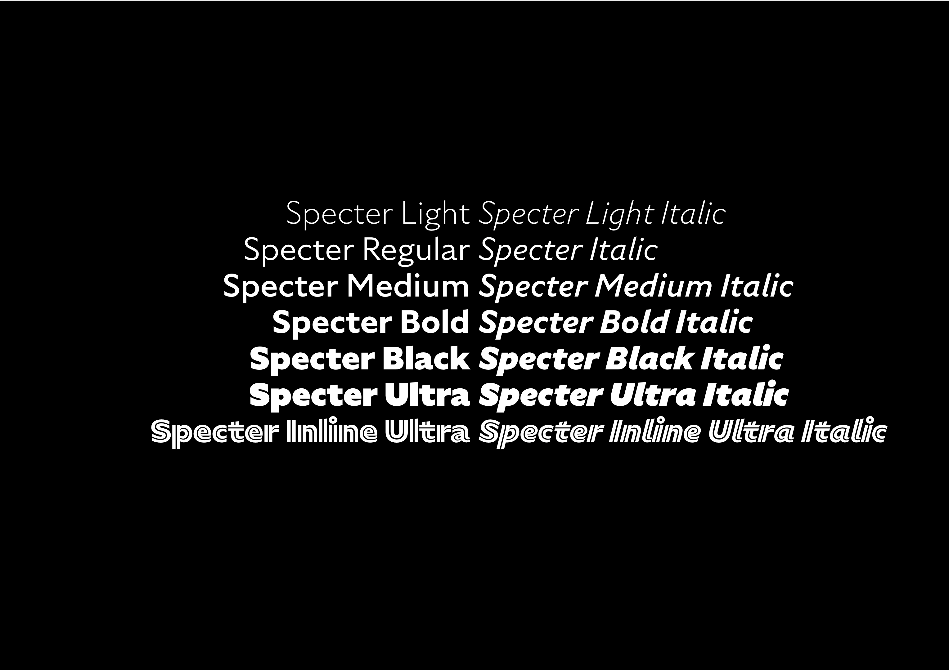
- Specter Light & Italic
- Specter Regular & Italic
- Specter Medium & Italic
- Specter Bold & Italic
- Specter Black & Italic
- Specter Ultra & Italic
- Specter Inline Ultra & Italic
Granby is a sans-serif typeface designed and released by the Stephenson Blake type foundry of Sheffield in 1930. It is influenced by the Johnston typeface or Railway Alphabet (1916), the proprietary face of what became London Underground, as well as by Gill Sans (1928), which had recently been released and become popular. Roy Millington's history of Stephenson Blake also cites Futura as an influence.
Granby is a sans-serif typeface designed and released by the Stephenson Blake type foundry of Sheffield in 1930. It is influenced by the Johnston typeface or Railway Alphabet (1916), the proprietary face of what became London Underground, as well as by Gill Sans (1928), which had recently been released and become popular. Roy Millington's history of Stephenson Blake also cites Futura as an influence.
Granby is a sans-serif typeface designed and released by the Stephenson Blake type foundry of Sheffield in 1930. It is influenced by the Johnston typeface or Railway Alphabet (1916), the proprietary face of what became London Underground, as well as by Gill Sans (1928), which had recently been released and become popular. Roy Millington's history of Stephenson Blake also cites Futura as an influence.
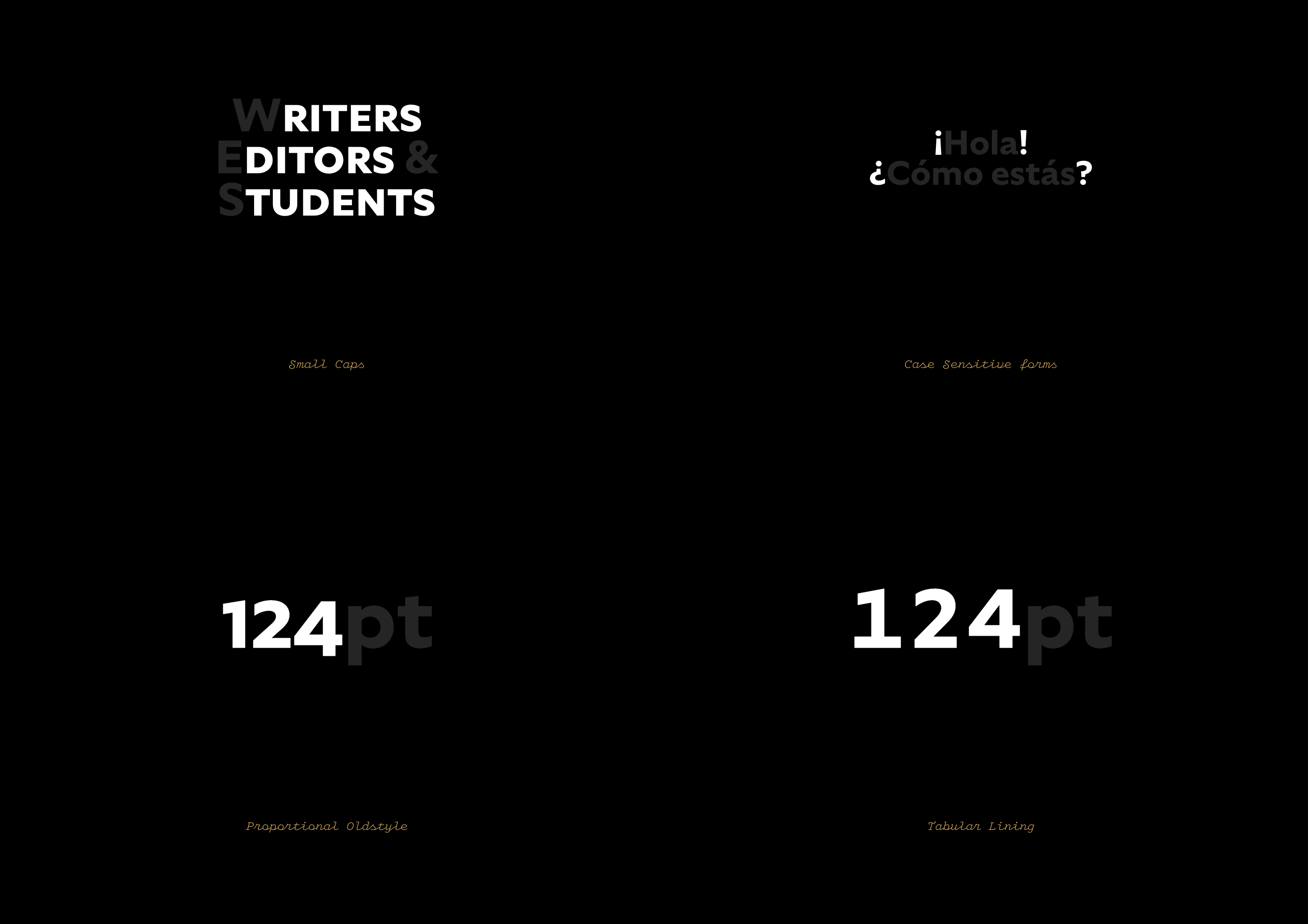
Complete Set of Alternates
abcdefghijklmn
opqrstuvwxyz
¡¿@/\-–—
0123456789
0123456789
aáăâäàāąåãgğĝģġyýŷÿ
aáăâäàāąåãyýŷÿ
JĴ
ZŹŽŻzźžż
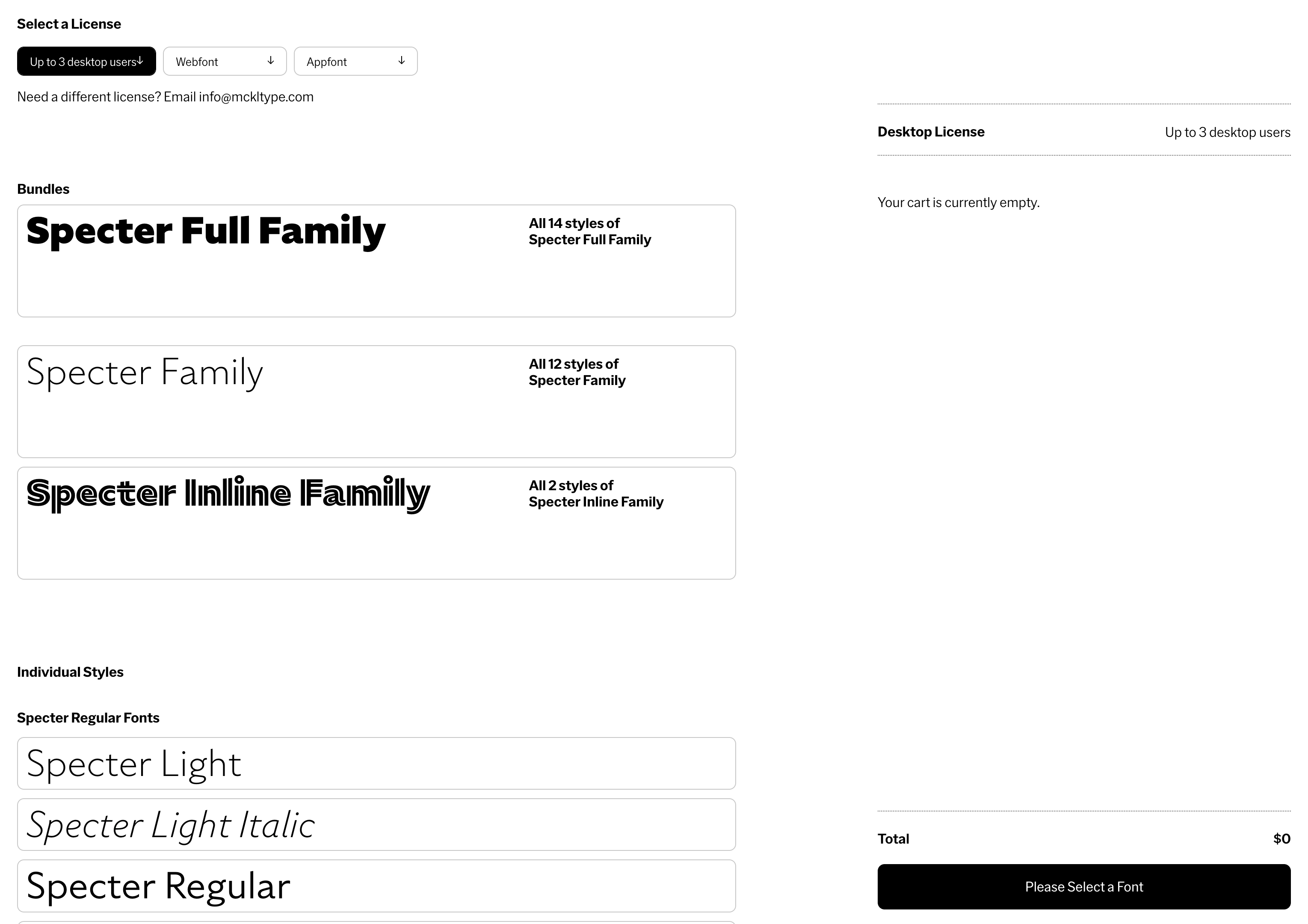
Select a License
Need a different license? Email info@mckltype.com
Bundles
Individual Styles
Specter Regular Fonts
Specter Inline Fonts
Your cart is currently empty.