A Scotch from Across the Atlantic: Designing a new typeface from overlooked American interpretations of a typographic classic
4 min read
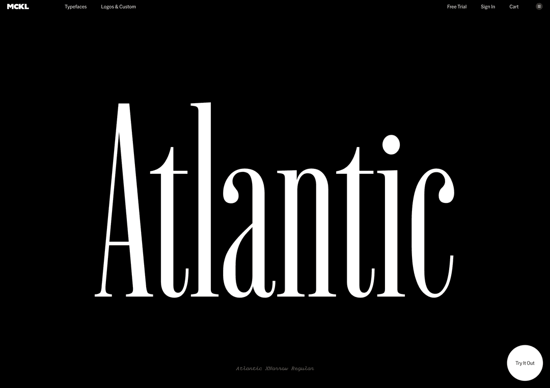
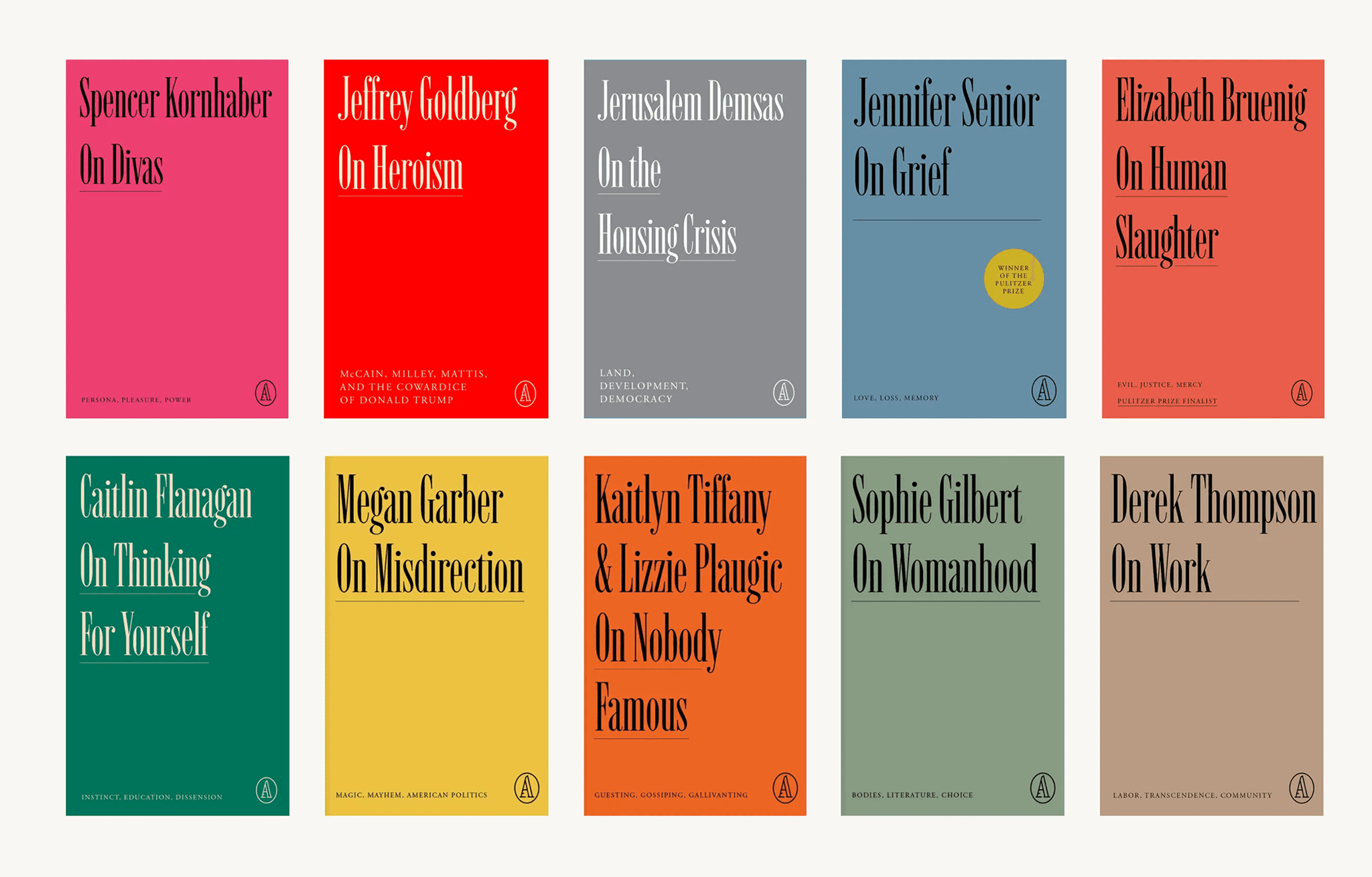
Atlantic is a family of display serif typefaces designed for editorial impact and typographic authority. Originally commissioned for the 2019 redesign of The Atlantic, the project has since expanded into a broader system of headline fonts spanning three widths across multiple weights with roman and italic styles.
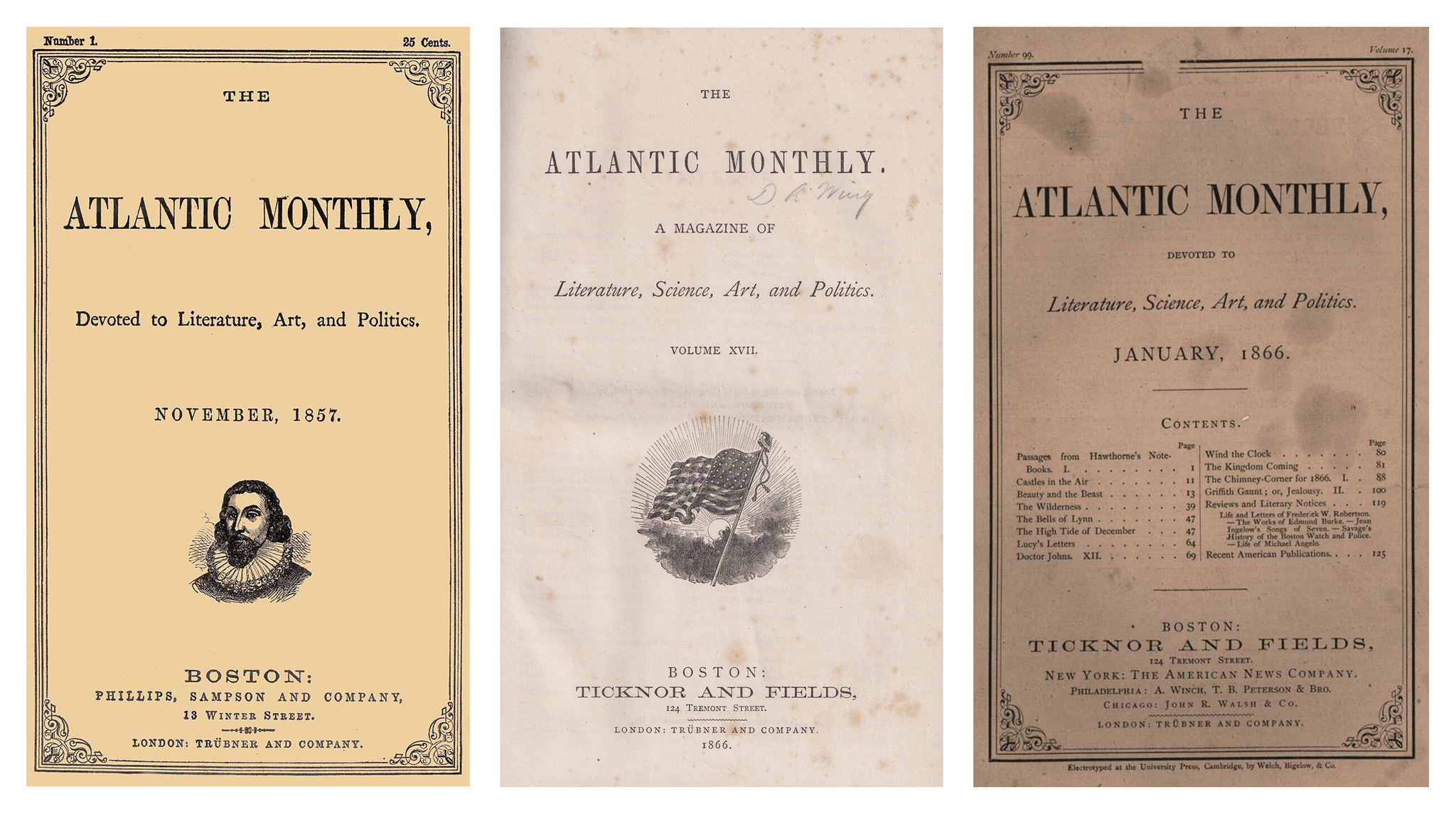
In 2019 I was approached by Oliver Munday with an intriguing opportunity: to design a headline typeface for a redesign of The Atlantic. First published in 1857, the magazine is one of the oldest continuously published periodicals in the United States.
Oliver, along with creative director Peter Mendelsund, were inspired by the original Atlantic nameplate. At first glance, the logo appeared to share the high contrast and vertical stress associated with modern typefaces like Bodoni. But the underlying construction was softer, less rational, and more closely related to the Scotch Romans that became popular throughout the 19th century. That distinction opened up a much more interesting line of research.
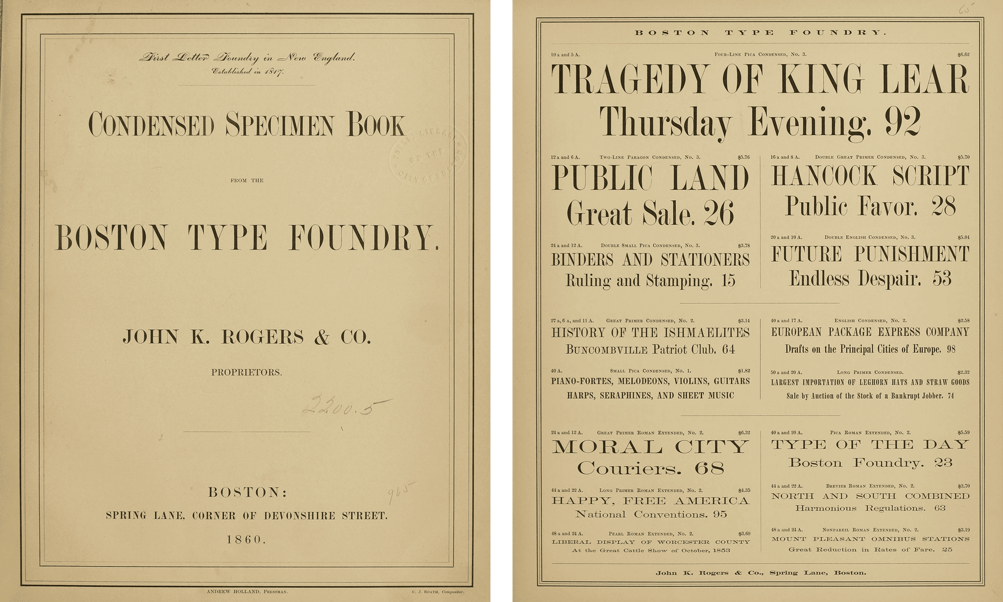
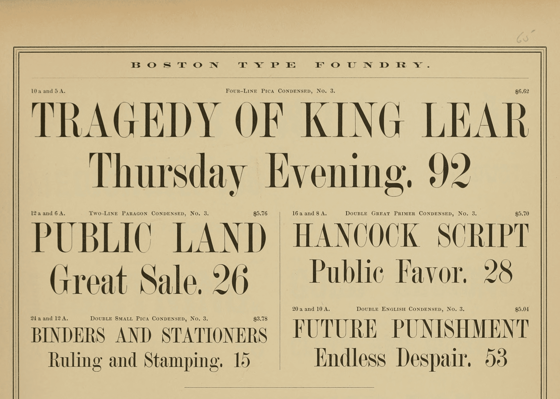
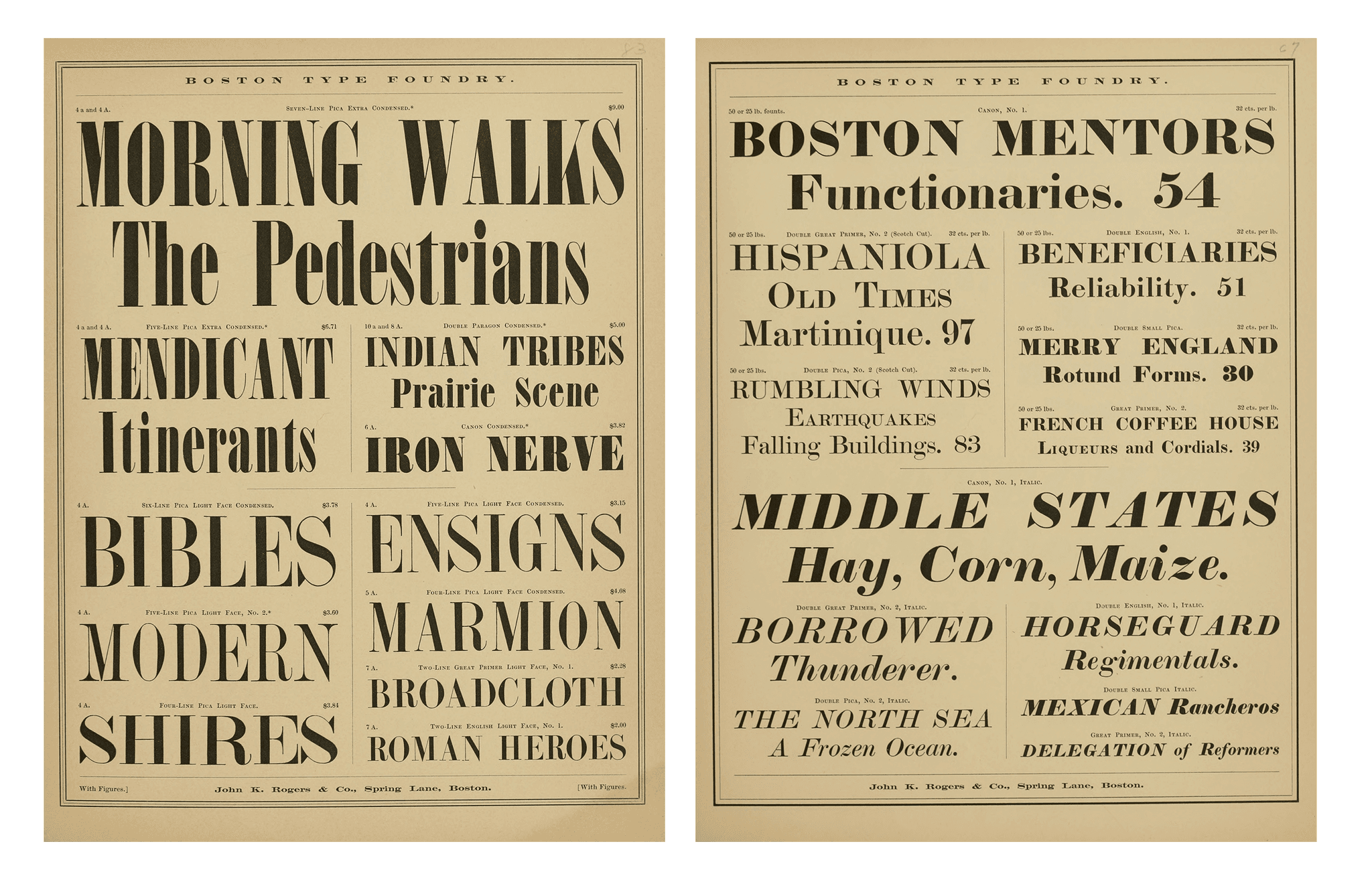
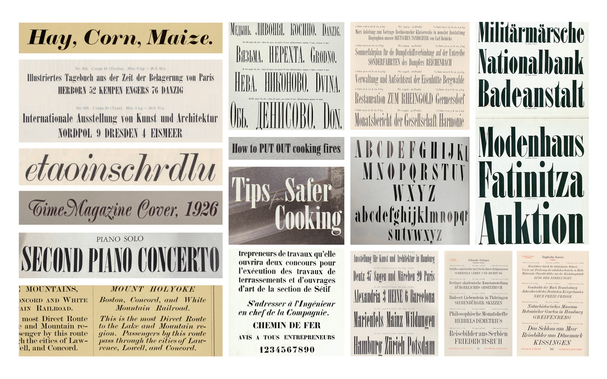
Tracing the history of the magazine led me to American interpretations of Scotch Roman typefaces that were circulating around the time of the original publication. Many were likely supplied by the Boston Type Foundry, though similar designs existed across regional foundries in the United States.
The British Scotch Romans produced by foundries like Miller & Richard were elegant and refined. The American versions were stranger: slightly crude, and full of inconsistencies.
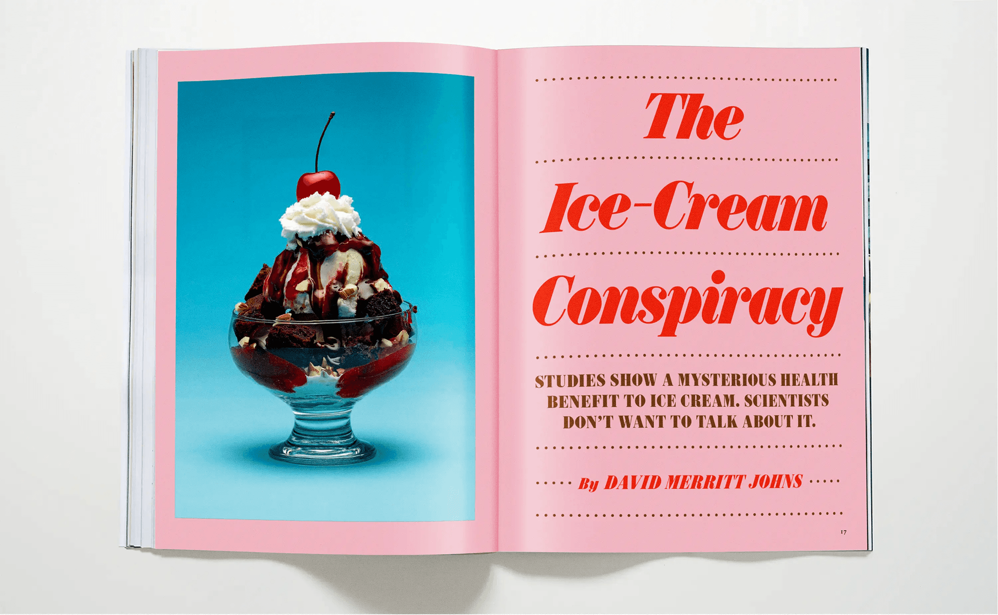
The contrast occasionally pushed beyond elegance into something sharper and more mechanical. I found those irregularities beautiful. Those references became the starting point for the project, though not the final destination. Rather than creating a faithful revival, we used the source material as a foundation for something contemporary: a typeface designed to work across print, digital, social, and the evolving editorial voice of the magazine.
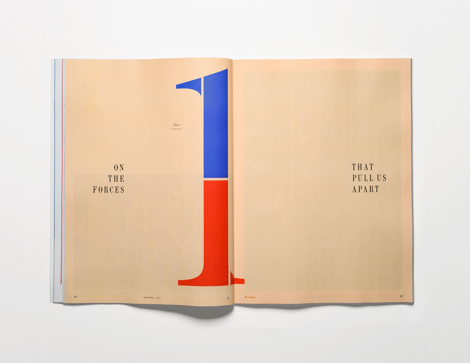
The original commission was relatively modest: a single display serif to serve as the typographic voice of the redesign, along with a new wordmark. The redesign launched at the end of 2019 and quickly established itself as one of the defining editorial systems of the period, earning recognition from the Society of Publication Designers and helping solidify a distinctive visual voice for the publication.
What became especially interesting was watching the typeface accumulate meaning through repetition. Over time, the typography itself became synonymous with the magazine. In social media environments especially, a sharply set serif headline in Title Case began to function almost like a logo for the brand.
Not long after launch, I found myself returning to the original sketches. Early explorations had included much narrower and more exaggerated interpretations of the design, and it felt like there was still unexplored territory within the genre.
Because I had retained the rights to the original typeface, including the ability to expand and publish the family independently, we began developing the project further at MCKL. Along with my team, we explored XNarrow styles, italics, and a much broader range of weights.

The Scotch Roman genre proved remarkably flexible, and each expansion into new territory revealed new possibilities.
Eventually we returned to The Atlantic with a proposal: what if the typeface became something much larger? Not simply a headline font, but an expansive typographic system capable of extending the publication’s voice across every platform and initiative.
They embraced the idea wholeheartedly, and we ended up licensing the larger family to them exclusively for a period of time.
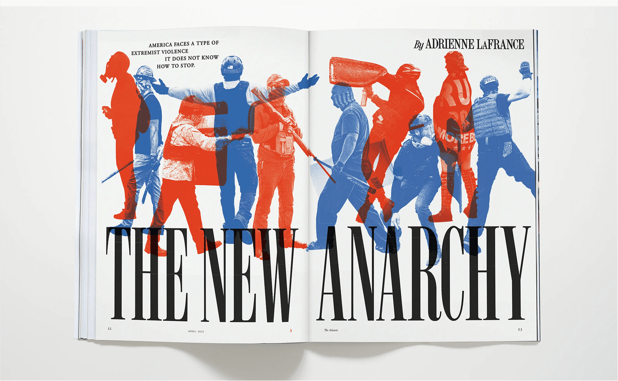
Since then, the Atlantic family has appeared everywhere from feature wells and cover stories to The Atlantic Festival, branded publications, and digital campaigns. One of the great luxuries of working with a magazine is the ability to watch the typography evolve in public over time. Each issue became an opportunity to evaluate the system: what was succeeding, what could improve, and where the design could become more precise.

In preparation for publication, we redrew and refined the family extensively, revisiting every style and relationship across the system. The final release expands the original design into three widths: XNarrow, Narrow, and Condensed, spanning multiple weights and italics.
The commercial release also incorporates a number of small details developed over the course of the project: ligatures, circular numerals, and multiple arrow styles among them. Like the typeface itself, these additions grew out of the realities of editorial use and the desire to make the system feel expressive at every scale.
Though rooted in 19th century American Scotch Romans, Atlantic was ultimately designed for contemporary publishing: a family intended to fill space with clarity, tension, and editorial authority.
Designed by Jeremy Mickel
Published by MCKL and available exclusively at MCKLtype.com